Notch
Enjoy a peak flavour of coffee at Notch.
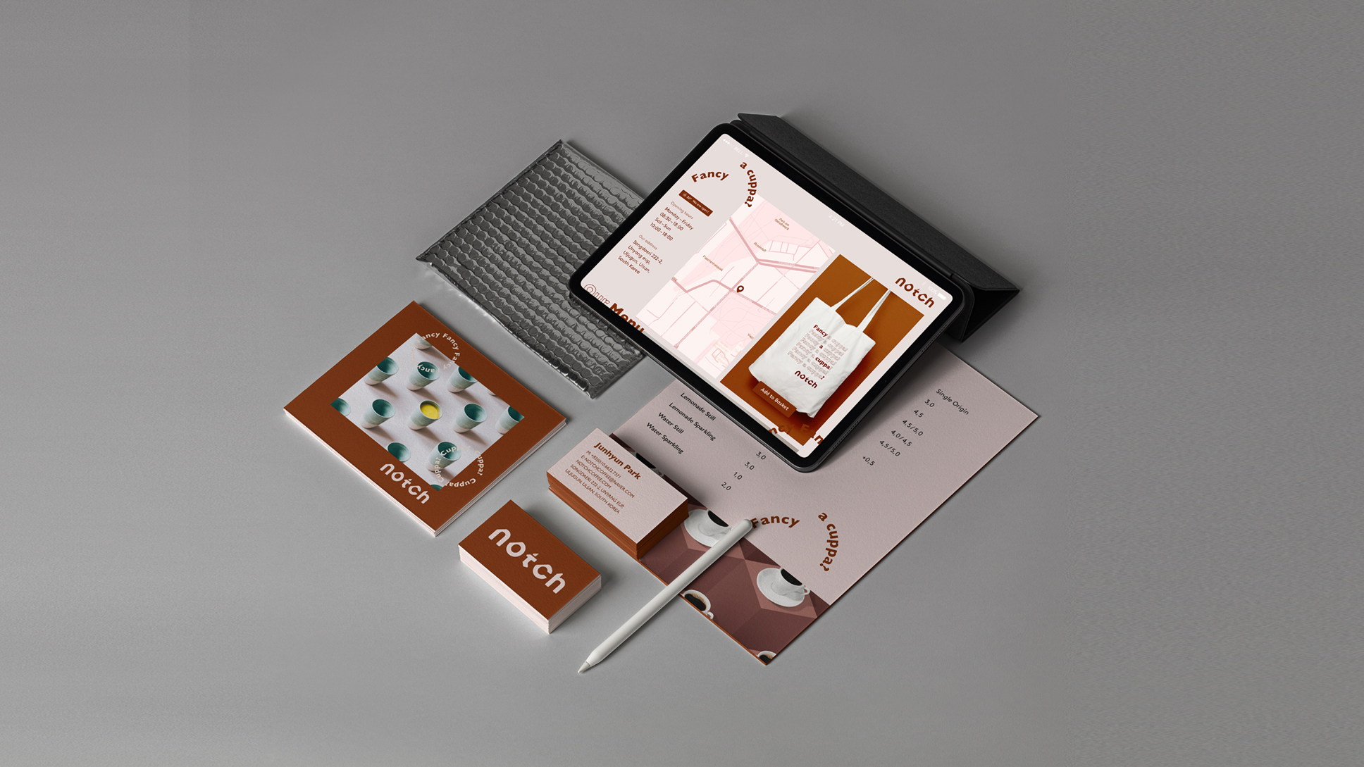
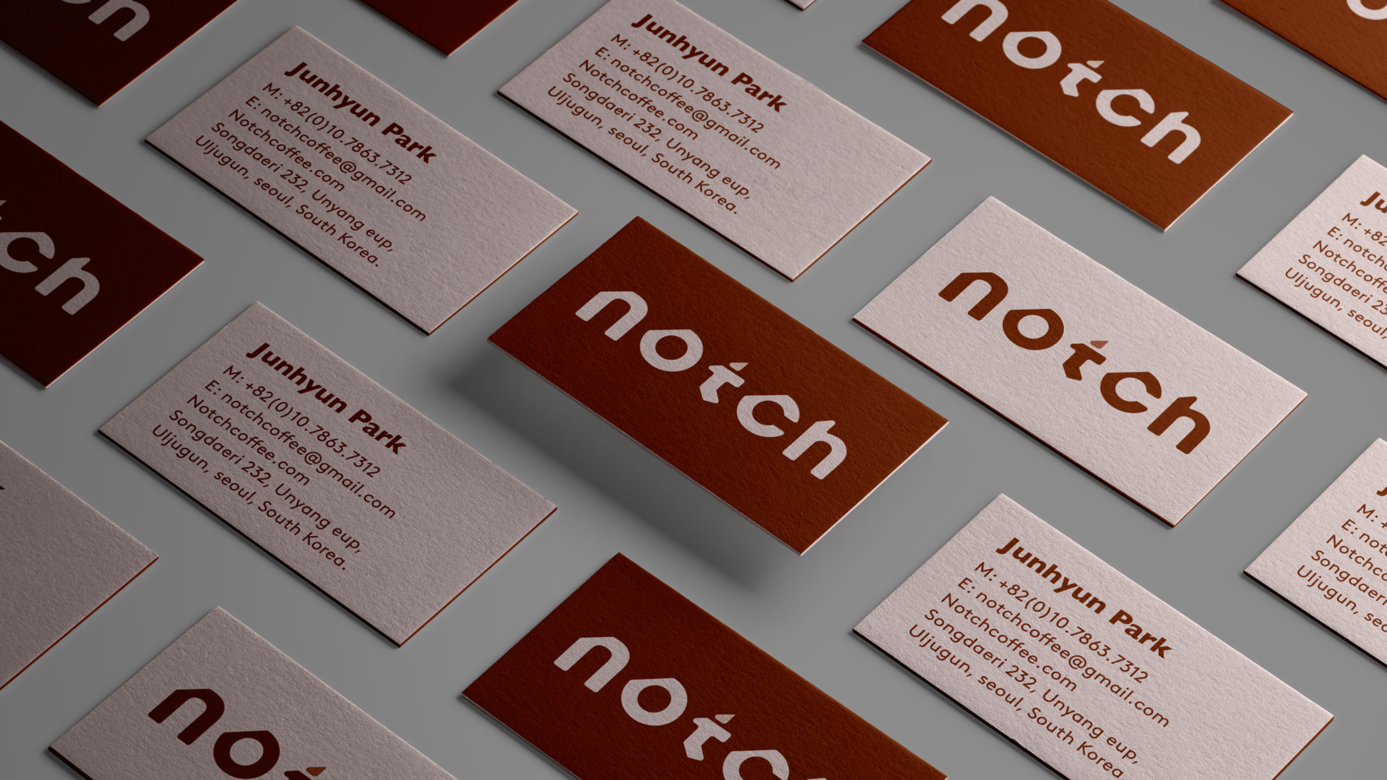
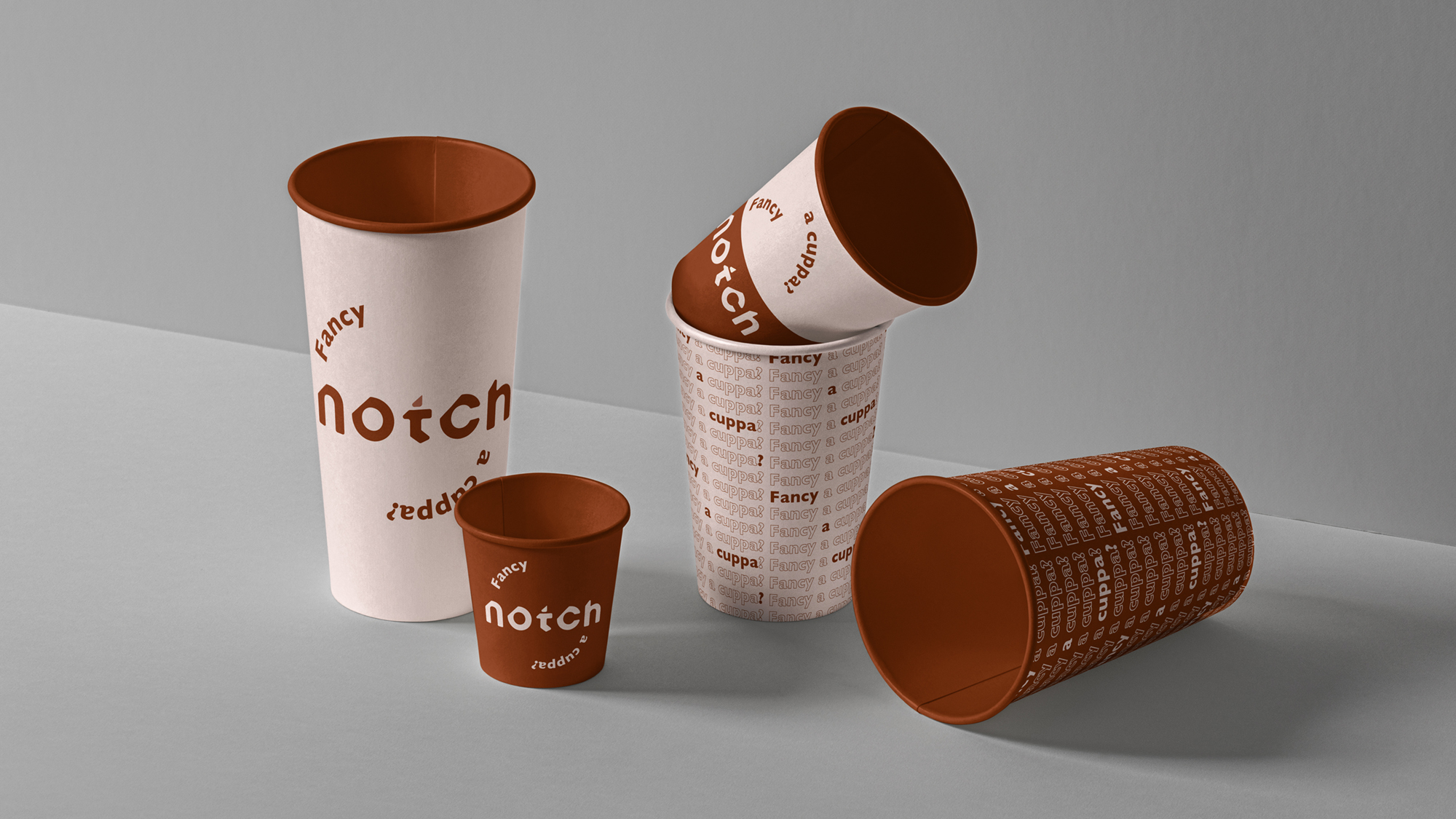
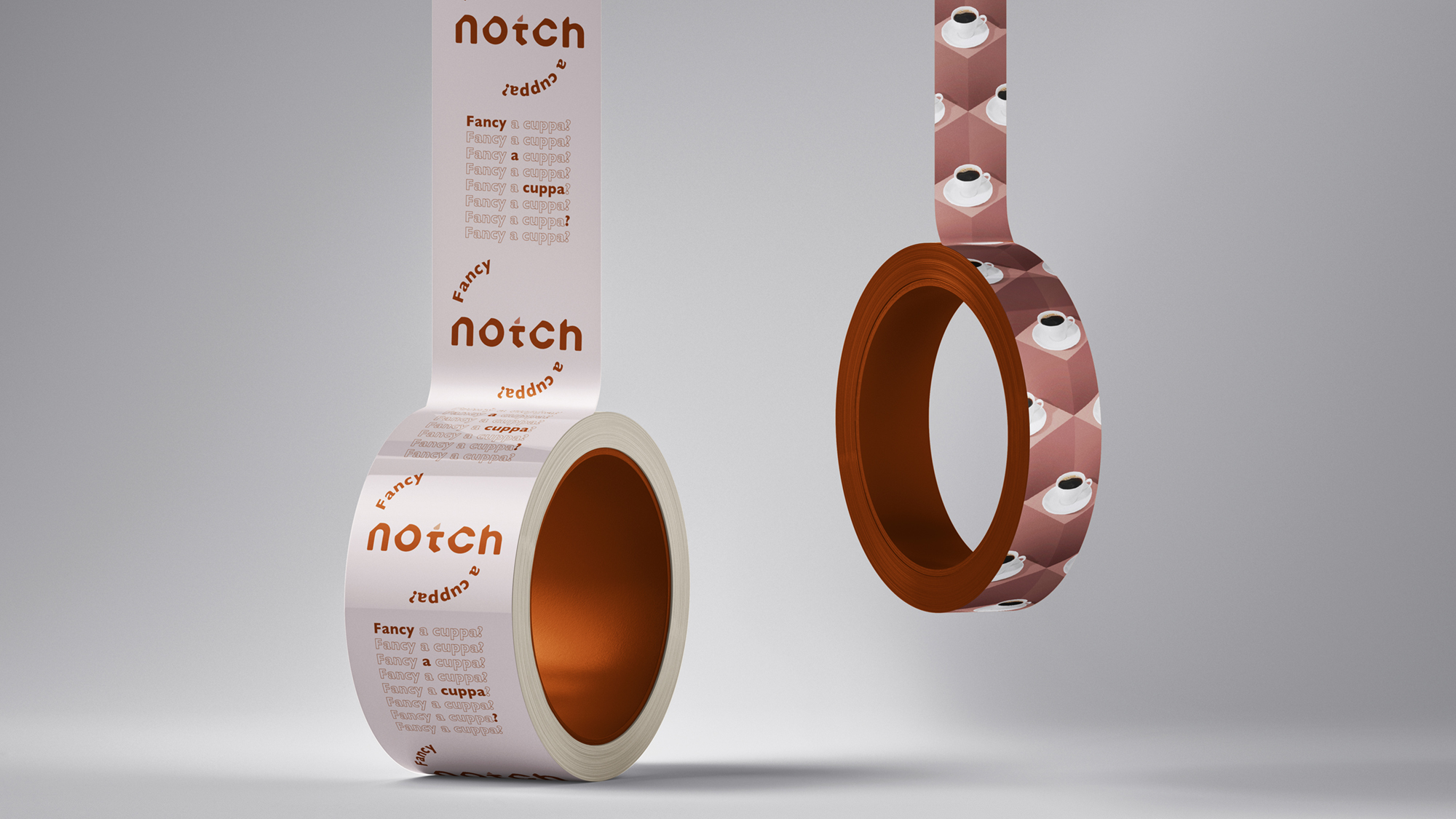
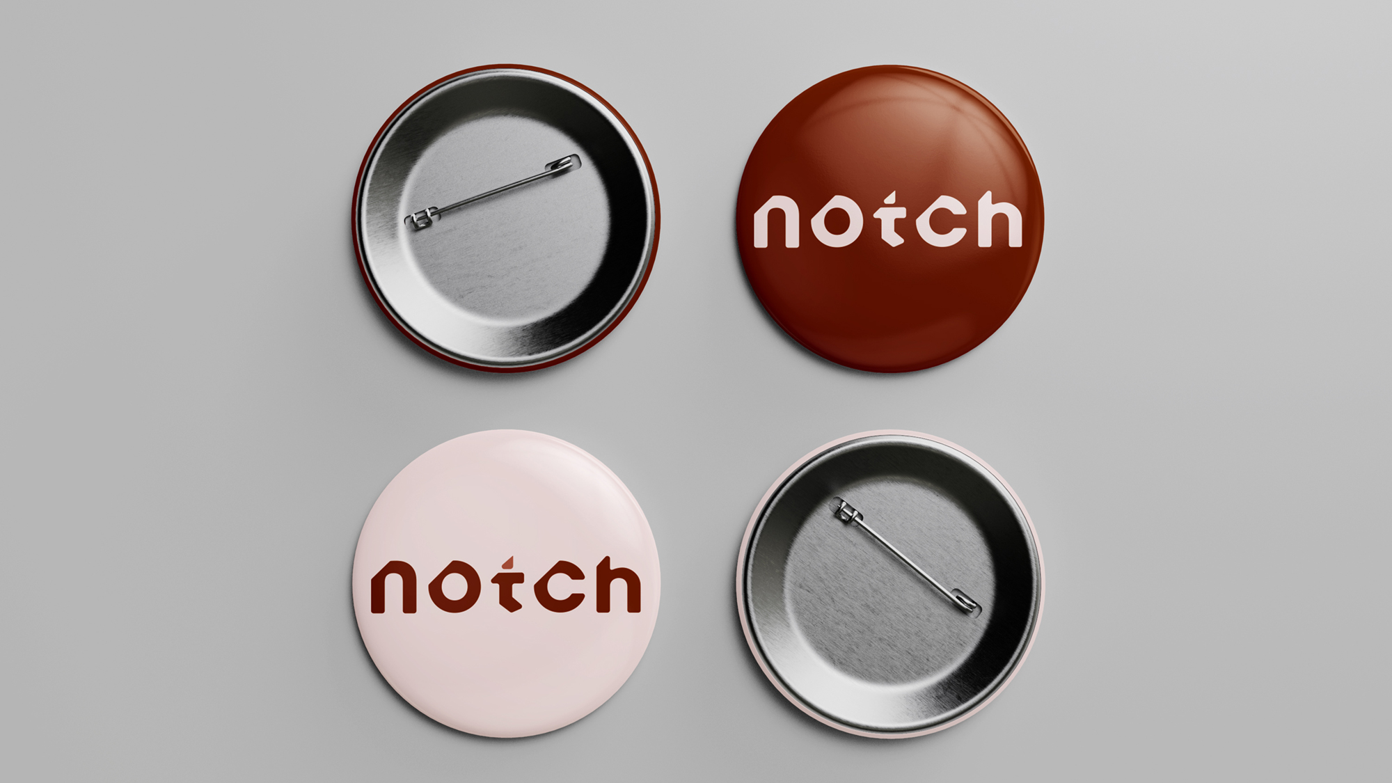
The meanings of ‘notch’ are a small V-shaped/ circular cut in the surface/ edge of something. A 30° angle cut within a square shape was the key structure to design the logo-type based on typeface ‘Brown’.
Mixing a geometric sans-serif brown with a humanist sans-serif gill-sans added up more of the uniqueness and playfulness to the brand.
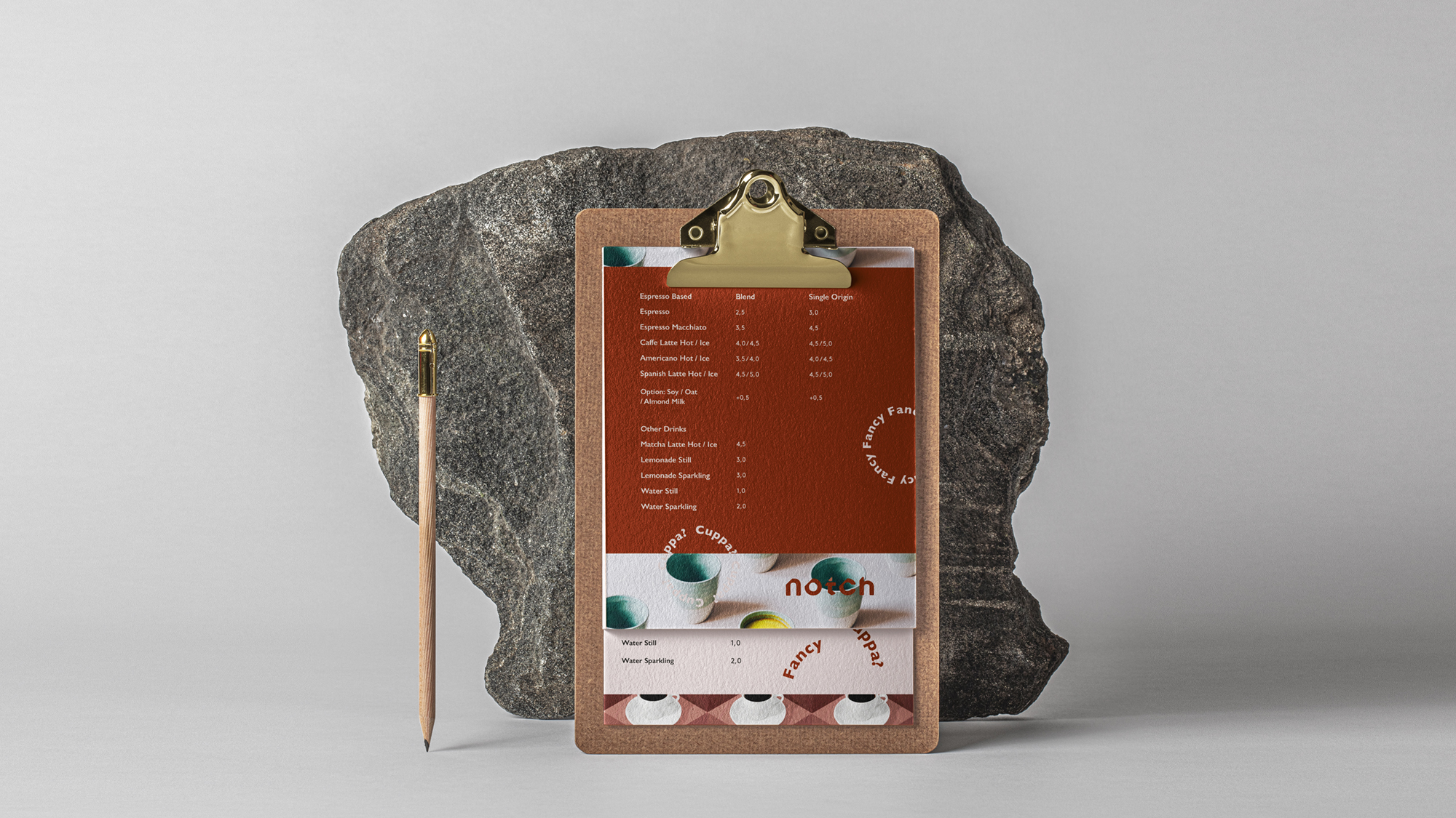
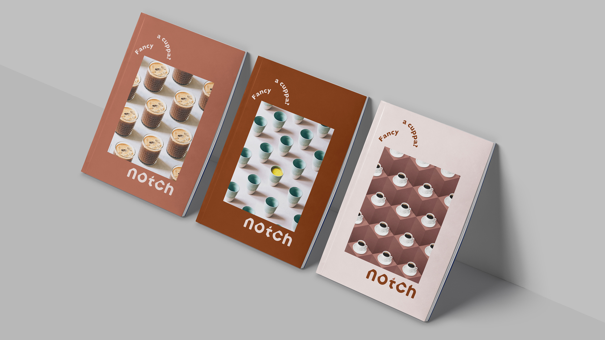
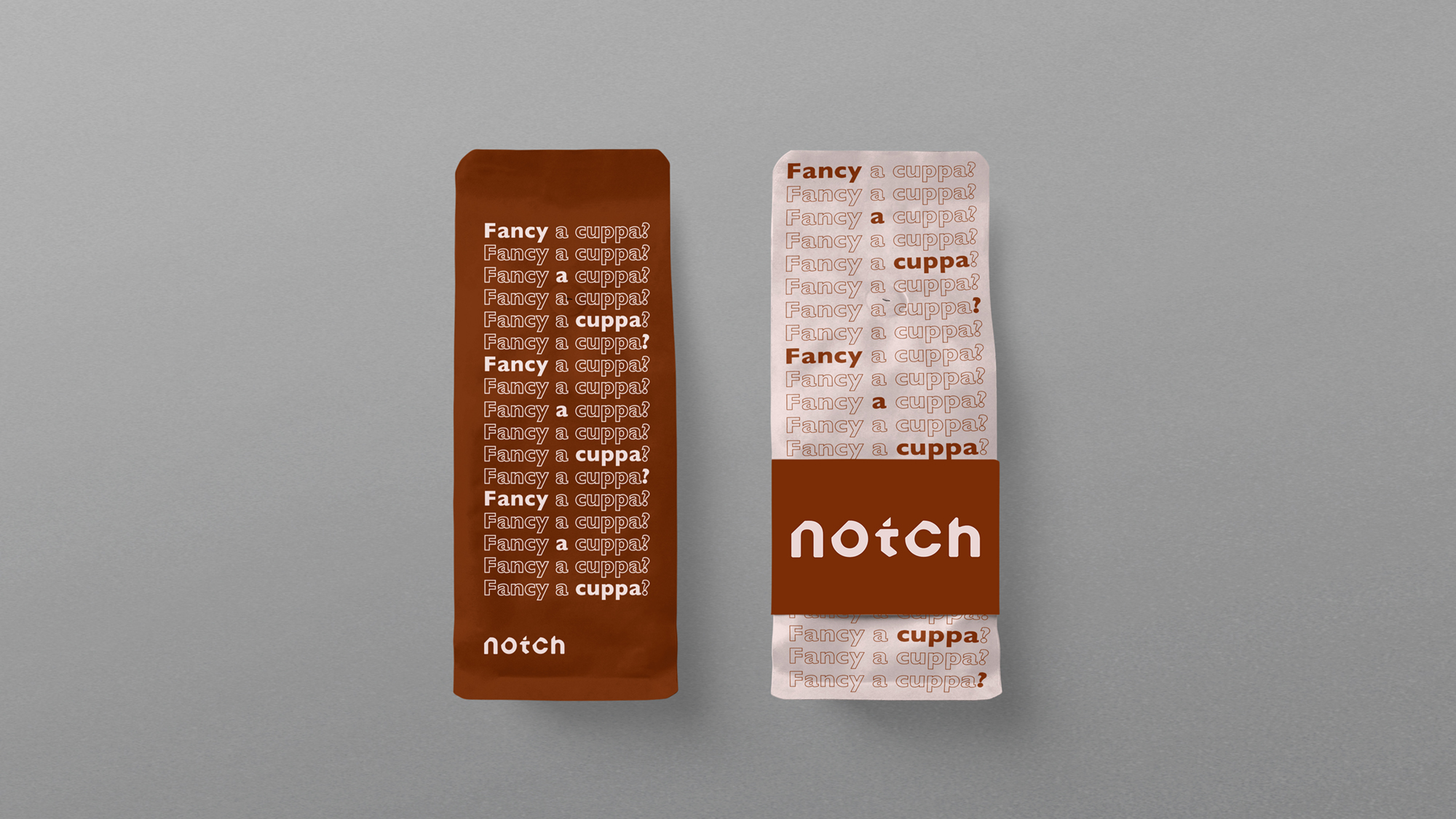
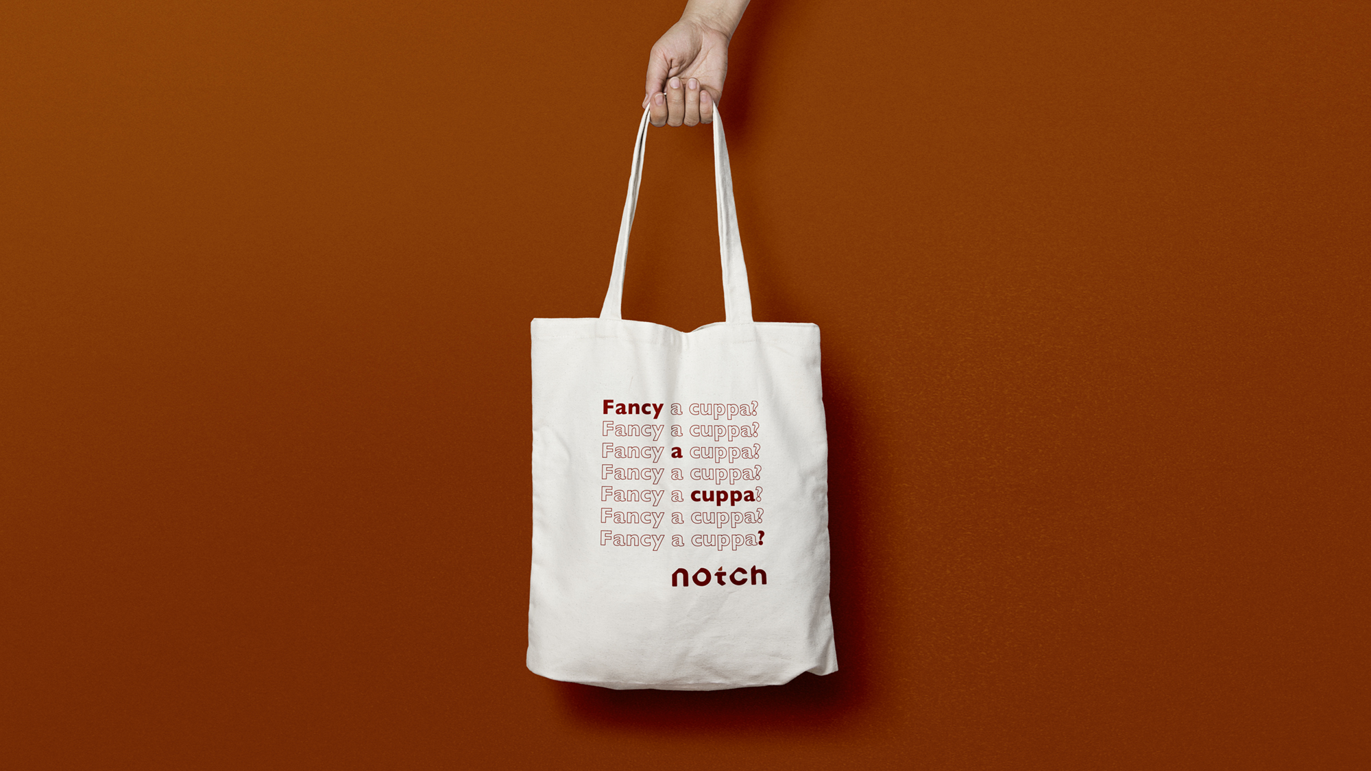
Notch offers a cozy place with its deliciousness for your unforgettable memory with your favourites. You “Fancy a cuppa?” then have it with us!
Ask your date/friends/colleagues & whoever you’d like to have a delicious moment. Key-words: Sophistication, harmonious & edge.Company................ Self-employed
Role ·················· Concept, naming & design (Print/Digital/Retail)
Field ················· Brand Identity (360°)
The meanings of ‘notch’ are a small V-shaped/ circular cut in the surface/ edge of something. A 30° angle cut within a square shape was the key structure to design the logo-type based on typeface ‘Brown’.
Mixing a geometric sans-serif brown with a humanist sans-serif gill-sans added up more of the uniqueness and playfulness to the brand.
Notch offers a cozy place with its deliciousness for your unforgettable memory with your favourites. You “Fancy a cuppa?” then have it with us!
Ask your date/friends/colleagues & whoever you’d like to have a delicious moment. Key-words: Sophistication, harmonious & edge.Company................ Self-employed
Role ·················· Concept, naming & design (Print/Digital/Retail)
Field ················· Brand Identity (360°)


Enjoy Running in my beautiful Park! :)
© Ran Park 2024